
You’re getting traffic, but the wrong page design is turning ready-to-buy visitors into bounces, abandoned forms, and missed calls. That’s the very cost of poor lead generation landing page design. A local business can rank for “SEO agency near me,” pay for Google Ads clicks, or invest in Local SEO, then still lose the sale because the landing page doesn’t match intent, doesn’t build trust fast enough, or asks for too much too soon.
Business owners in Miami see this every day. The phone should be ringing. Consultations should be getting booked. Instead, the page looks decent, traffic arrives, and almost nobody converts. That usually isn’t a traffic problem. It’s a conversion architecture problem.
If your current landing pages feel busy, generic, or vague, they’re probably leaking high-intent demand to a competitor with a clearer offer and a cleaner funnel.
Table of Contents
- Your Website Is Leaking Money Right Now
- The Blueprint for a Lead Generation Machine
- Anatomy of a High-Converting Landing Page
- The Technical Foundation You Cannot Ignore
- Launch is Just the Beginning Your A/B Testing Plan
- Why a Miami Business Needs More Than a Generic Template
Your Website Is Leaking Money Right Now
A business owner checks campaign performance, sees clicks coming in from Google Ads or organic search, then opens the inbox and finds almost nothing. Maybe one form submission. Maybe a low-quality lead. Maybe no booked consultations at all.
That pattern is common because most landing pages aren’t built for buyer intent. They’re built to look acceptable.
Traffic without conversion is wasted budget
A visitor searching “Google Ads agency for small business” or “local SEO services in Miami” already has commercial intent. They’re not casually browsing. They want a solution, and they want to know fast whether your page is relevant, credible, and easy to act on.
If the message is vague, the page loads slowly, or the form feels like paperwork, that prospect leaves. The ad spend is gone. The SEO effort did its job, but the page didn’t.
Research on landing page volume points to the same lesson. A 2025 analysis found that companies with more than 40 landing pages generated over 500% more leads than companies with fewer than 10, and businesses that expanded from 10 to 15 pages saw a 55% increase in conversions because segmented pages perform better than generic ones (Salesgenie landing page statistics).
Practical rule: If one page is trying to serve every audience, it usually converts none of them well.
A lot of owners sense this but don’t know where the leak is. If you want a useful breakdown of the failure points, this guide on why landing pages don’t convert is worth reviewing because it mirrors what shows up in real campaigns.
Most underperforming pages fail in predictable ways
The biggest issues are rarely mysterious:
- Weak intent match: The ad promises one thing, but the page opens with generic agency language.
- Competing actions: Users see “Call Now,” “Learn More,” “View Services,” and “Read Blog” all at once.
- Bloated forms: The page asks for too much before trust has been established.
- Thin proof: There’s no visible reason to believe the business can deliver.
- Slow performance: Users drop before they even read the offer.
A landing page should feel like a straight path. Most pages feel like a lobby with too many doors.
There’s also a hidden issue. Owners often focus on the ad account or rankings first, when the underlying problem is page experience. Improving technical performance helps remove friction before the conversion even starts. A faster page and cleaner UX often produce a stronger return than merely sending more traffic, especially if you address basics like website loading speed improvements.
If you’re paying for clicks or investing in SEO right now, a landing page audit isn’t optional. It’s the fastest way to find out why interest isn’t becoming inquiries.
The Blueprint for a Lead Generation Machine
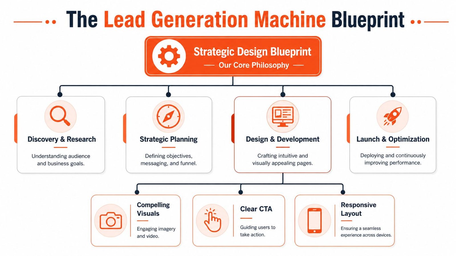
A high-performing landing page isn’t a collection of tips. It’s a system. The pages that generate calls, consultations, and qualified inquiries follow a predictable structure because they remove ambiguity at every step.
This is the operating model behind effective lead generation landing page design.
Message match comes first
When someone clicks a Google Ads headline about lead generation for local businesses, the landing page must continue that exact conversation. Not a broader one. Not a brand story. Not a list of everything the agency does.
The first screen needs to confirm three things immediately:
- What the offer is
- Who it’s for
- What action to take next
If a Miami law firm clicks an ad about local SEO, the page should speak to law firm visibility, local search intent, and consultations. If a restaurant owner clicks an ad about Meta Ads for reservations, the page should address reservation demand and location-based campaigns.
One page, one goal
Pages fail when they try to be a homepage, brochure, and sales deck all at once. High-converting landing pages narrow the user’s decision to one next step.
Split-test evidence shows that pages with multiple offers or CTAs can see conversion rates drop by 20–30% compared with pages focused on one clear outcome (Perspective on one-offer one-CTA landing pages).
That means the page should drive one action such as:
- Book a strategy session
- Request a quote
- Schedule a consultation
Not all three.
The more choices a high-intent visitor sees, the easier it becomes for them to delay the decision.
Frictionless conversion and trust architecture
Even a strong offer gets ignored if the path to conversion feels annoying. Friction shows up in small ways. Long forms. Vague buttons. Dense copy. Missing trust signals. Poor spacing on mobile.
A better page does four things well:
| Element | What weak pages do | What strong pages do |
|---|---|---|
| Offer | Speak broadly | Speak to one audience and one service |
| CTA | Give multiple routes | Present one obvious action |
| Form | Ask for too much upfront | Ask only for what’s needed now |
| Proof | Hide credibility lower down | Put trust near the decision point |
This is why a business often needs more than a drag-and-drop template. Effective conversion work sits at the intersection of copy, UX, local intent, offer strategy, and technical execution. That’s also why a polished-looking site can still underperform if the actual conversion path wasn’t built strategically. A strong foundation in website design for local business matters because the page has to support action, not just appearance.
Anatomy of a High-Converting Landing Page
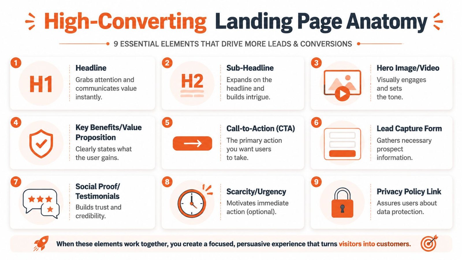
The fastest way to improve lead flow is to look at the page from top to bottom and fix each conversion point. Every block on the page either moves the visitor closer to contact or gives them a reason to leave.
What belongs above the fold
The first visible screen does the heavy lifting. Research notes that high-converting lead generation pages place the headline, core benefits, and CTA above the fold, helping visitors decide within seconds whether to engage (Unbounce examples of high-converting lead generation landing pages).
That first screen should include:
- A headline with direct value: Say what the service does and who it helps.
- A subheadline with context: Clarify the offer and reduce uncertainty.
- A visible CTA: Make the next action obvious.
- Immediate trust cues: Reviews, badges, or a testimonial excerpt.
Grow Your Business With Effective Marketing Solutions
Better example:
“Get More Calls and Qualified Leads with Local SEO and Google Ads in Miami”
The first one sounds polished. The second one sells.
A lot of modern page builders make it easy to produce something visually clean but strategically weak. That’s why it helps to compare your page against current landing page best practices for 2026, especially if your team has been relying on design trends instead of buyer intent.
What to say and what to avoid
Body copy should continue the buying conversation, not restart it with generic branding.
Use short blocks that answer the questions prospects already have:
- What problem do you solve?
- Why should they trust you?
- What happens next if they contact you?
Don’t write paragraphs about being passionate, cutting-edge, or committed to excellence. Every competitor says that. Say what changes for the customer.
A strong landing page doesn’t describe the business. It describes the result the buyer wants.
A useful structure is simple:
- State the problem clearly
- Show the cost of leaving it unresolved
- Present the service as the direct fix
- Make the next step easy
For a local service business, that might look like this:
- Problem: Your business gets traffic but not enough booked calls.
- Consequence: Competitors capture the same high-intent search traffic.
- Solution: A focused page aligned with Local SEO, Google Ads, or Meta Ads intent.
- Next step: Book a consultation.
To see the difference between explanation and execution, watch this breakdown before reviewing your own page:
How the form and CTA should work together
Most pages lose leads at the form.
The form should collect the minimum needed to start the sales conversation. The CTA should tell the user what they get by submitting it. Those two elements have to feel connected.
Here’s the right comparison:
| Page element | Don’t do this | Do this instead |
|---|---|---|
| Headline | Generic brand statement | Specific service plus outcome |
| CTA button | “Submit” | “Book Your Free Strategy Session” |
| Form fields | Ask for every detail | Ask only what supports first contact |
| Trust block | Put testimonials near footer | Place proof beside or just below form |
The button text matters because “Submit” describes a task. “Book Your Free Strategy Session” describes a benefit.
The form itself should feel low pressure. Ask for the essentials, then gather more information after the initial conversion through intake, CRM follow-up, or the sales call. If your current page buries the form, weakens the CTA, or overloads the user with choices, it likely needs a broader website conversion rate improvement strategy.
The Technical Foundation You Cannot Ignore
A landing page can have strong copy and still fail because the technical setup creates friction before the visitor ever reaches the form. As a result, many businesses lose leads without realizing it.
Speed, mobile UX, and lead loss
Traffic from Google Ads, Local SEO, and mobile search is impatient. Users land, scan, and decide fast. If the page stutters on load, shifts visually, or forces awkward scrolling, the conversion chance drops before the offer gets a fair read.
This becomes even more important once the form appears. Studies show that forms with only 2–3 fields convert significantly better than forms with 6 or more, and shortening a form can increase conversions by 25–50%. The same research notes that each additional field can reduce submissions by roughly 15–20% (Unlayer research on lead generation landing pages).
That doesn’t mean every page should use the same tiny form. It means every field has to justify its existence.
A practical mobile-first checklist looks like this:
- Field count: Ask only for name, email, and phone if that’s enough to start.
- Tap targets: Buttons and fields should be easy to use on a phone.
- Visual hierarchy: Users should know where to look first without hunting.
- Load discipline: Large images, scripts, and unnecessary widgets should be controlled.
- Readable layout: Short sections outperform cramped blocks on smaller screens.
Tracking tells you what is actually broken
Many businesses guess why a page underperforms. Good tracking removes the guesswork.
You need visibility into:
- Which traffic source produced the visit
- Which campaign or keyword sent the user
- Where users dropped off
- Which form completions became booked consultations
- Which device types underperform
That means setting up analytics properly, using UTM parameters consistently, and defining conversion goals around real business outcomes such as form submissions, calls, or consultation bookings.
Technical problems don’t announce themselves. They show up as silent drop-off, weak form completion, and traffic that never turns into revenue.
Security also affects performance and trust more than many owners assume. If a site is unstable, outdated, or vulnerable, users notice the symptoms even if they never see the backend issue. Ongoing maintenance matters, especially on WordPress builds, and these WordPress security best practices are part of keeping a conversion asset reliable over time.
If your page isn’t tracked correctly, you can’t improve it with confidence. You’re just changing things and hoping.
Launch is Just the Beginning Your A/B Testing Plan
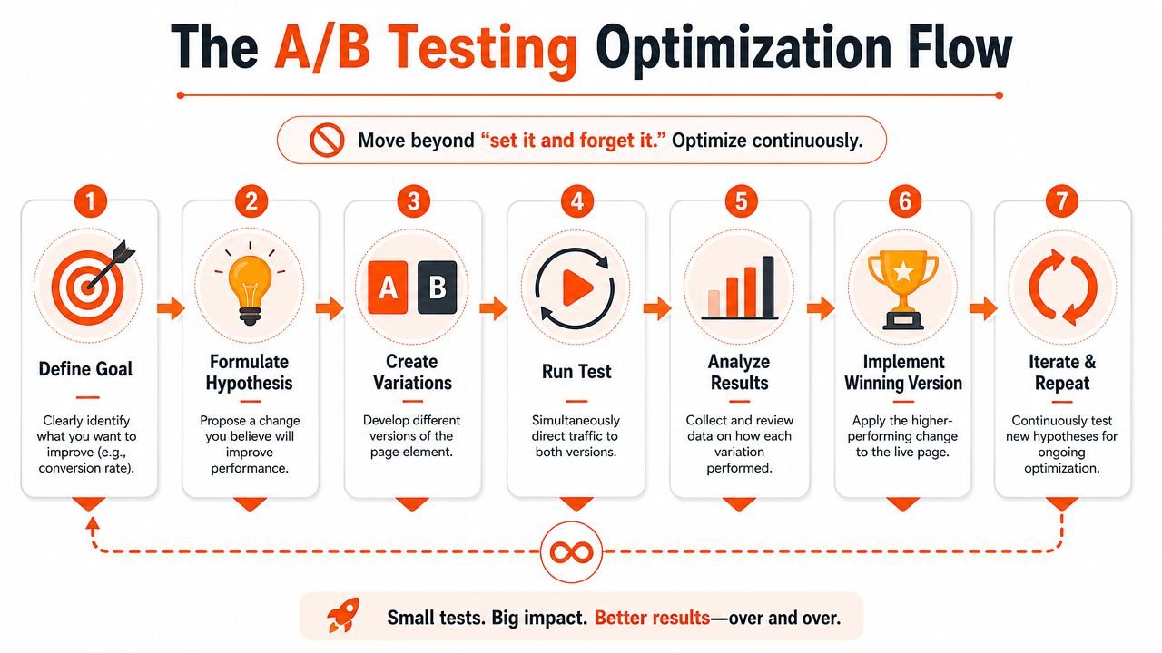
A landing page isn’t finished when it goes live. That’s when the actual work starts. Launch gives you a baseline. Optimization is what turns a decent page into a dependable lead source.
What to test first
The best tests target the biggest points of friction first, not cosmetic details.
Start with elements that directly influence action:
- Headline angle: Direct outcome versus softer positioning
- CTA wording: “Book a Consultation” versus “Get a Free Strategy Session”
- Form structure: Fewer fields versus more qualification upfront
- Proof placement: Testimonial near form versus lower on page
- Hero visual: Service-focused graphic versus real local imagery
Social proof placement can change behavior. Displaying at least two types of social proof, such as testimonials and trust badges, in the first visible sections can, for example, increase lead-form submissions by 15–30% (Orbit Media lead generation website practices).
How to run tests without guessing
A/B testing should be disciplined, not random. Each test needs one clear hypothesis.
For example:
| Test item | Hypothesis |
|---|---|
| Headline | A more specific local value proposition will increase inquiries |
| Form | Fewer first-step fields will improve submission rate |
| CTA text | A benefit-led button will outperform a generic command |
| Proof block | Trust near the form will reduce hesitation |
Use a simple process:
- Define one goal
- Change one meaningful variable
- Send comparable traffic
- Review the result
- Keep the winner and test again
If your team needs a practical reference, these A/B testing best practices are useful because they keep testing focused on decision quality instead of endless experimentation.
The important point is this. If a page gets traffic today, it can almost always get more out of that traffic with better testing discipline. Businesses that treat landing pages as living assets usually pull ahead of competitors still using a set-it-and-forget-it approach.
Why a Miami Business Needs More Than a Generic Template
A generic template can publish a page quickly. It usually can’t compete in a market like Miami where search intent, audience mix, and local trust signals directly shape conversion behavior.
Local intent changes the page strategy
A Miami law firm and a Wynwood restaurant do not need the same landing page, even if both want more leads.
A law firm page targeting searches like “local SEO services in Miami” or “SEO agency near me” should emphasize authority, service area relevance, practice-specific trust signals, and a clear consultation path. The user wants confidence, professionalism, and a reason to believe the firm will be visible where cases are won.
A restaurant campaign page tied to Google Ads or Meta Ads needs a different conversion path. It may focus on reservations, catering inquiries, private events, or online orders. The imagery, timing, and copy all need to reflect that buyer behavior.
That’s one reason localized messaging matters so much in South Florida. Existing guidance on landing pages rarely addresses cultural and language nuance well, even though around 19% of the U.S. population identifies as Hispanic and 23% of U.S. adults are bilingual Spanish-English speakers. That matters in markets like Miami where trust and clarity often improve when language, references, and micro-copy reflect the audience more closely (Landbot on lead generation landing pages and multilingual UX context).
Templates save time but cost leads
Templates usually fail in four places:
- They flatten local intent: The copy could belong to any city.
- They weaken trust: There’s no real alignment with local buyer concerns.
- They ignore service-specific journeys: A law consultation is not the same as a restaurant booking.
- They create sameness: Your competitors can look almost identical.
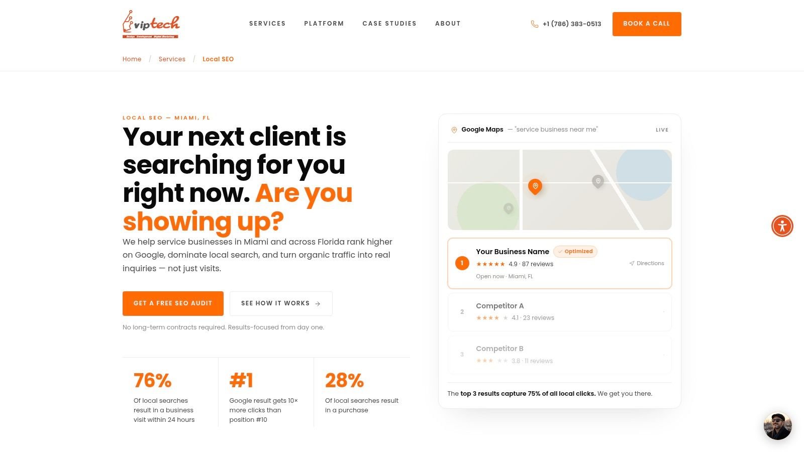
A better local page uses city-specific language, relevant proof, a focused service offer, and a clear route to contact. It also supports the broader acquisition system. If you’re trying to win more “near me” searches, improve Google Maps visibility, or turn paid traffic into real appointments, the page has to be custom-built around that outcome. Generic design won’t do it.
Can you build one yourself with a template? Yes.
Will it usually match the performance of a page built around local search intent, conversion psychology, form strategy, proof placement, technical speed, and testing discipline? Usually not.
For Miami businesses competing in legal, home services, hospitality, health, education, and professional services, local execution is the advantage. A stronger visual and conversion framework tied to actual market behavior makes a measurable difference in lead quality and booked consultations. If your current site still looks and reads like a broad template, compare it against a more localized Miami web design approach and you’ll see the gap quickly.
If your landing page is getting traffic but not enough calls, inquiries, or booked consultations, VIP TECH CONSULTING can help you fix the conversion path before you waste more demand. Book a free strategy session to get a clear plan for your SEO, Local SEO, Google Ads, or Meta Ads landing pages. In a competitive Miami market, waiting usually means more lost leads going to businesses that already have their funnel dialed in.