
A prospect searches for your service on their phone while standing in a parking lot, sitting in a waiting room, or comparing providers after hours. They tap your site. It loads slowly, the headline is buried, the menu is clumsy, and the call button is harder to find than it should be.
They back out and choose someone else.
That’s why mobile first website design isn’t a design trend. It’s a lead generation decision. If your business depends on local SEO, Google Ads, “near me” searches, booked calls, quote requests, or online orders, your mobile experience directly affects whether traffic turns into revenue.
A lot of business owners still think “mobile-friendly” is enough. It isn’t. A site that merely shrinks to fit a smaller screen can still lose rankings, waste ad spend, and frustrate high-intent visitors. The businesses winning local search today are the ones that make mobile the primary experience, then scale up intelligently for larger screens.
Table of Contents
- Your Website Is Losing Customers on Mobile Right Now
- Why Mobile-Friendly Is a Low Bar That Costs You Leads
- Mobile-First Design The Strategy for Dominating Local Search
- The Tangible ROI of a Mobile-First Approach
- Our Process What a High-Converting Mobile-First Build Includes
- Your Mobile-First Website Checklist
Your Website Is Losing Customers on Mobile Right Now
A Miami business owner doesn’t need another lecture about web design. They need to know why calls are inconsistent, why leads feel expensive, and why competitors keep showing up stronger in search.
Here’s one common reason. Your best prospects are landing on your site from a phone, and the experience isn’t good enough to keep them there.
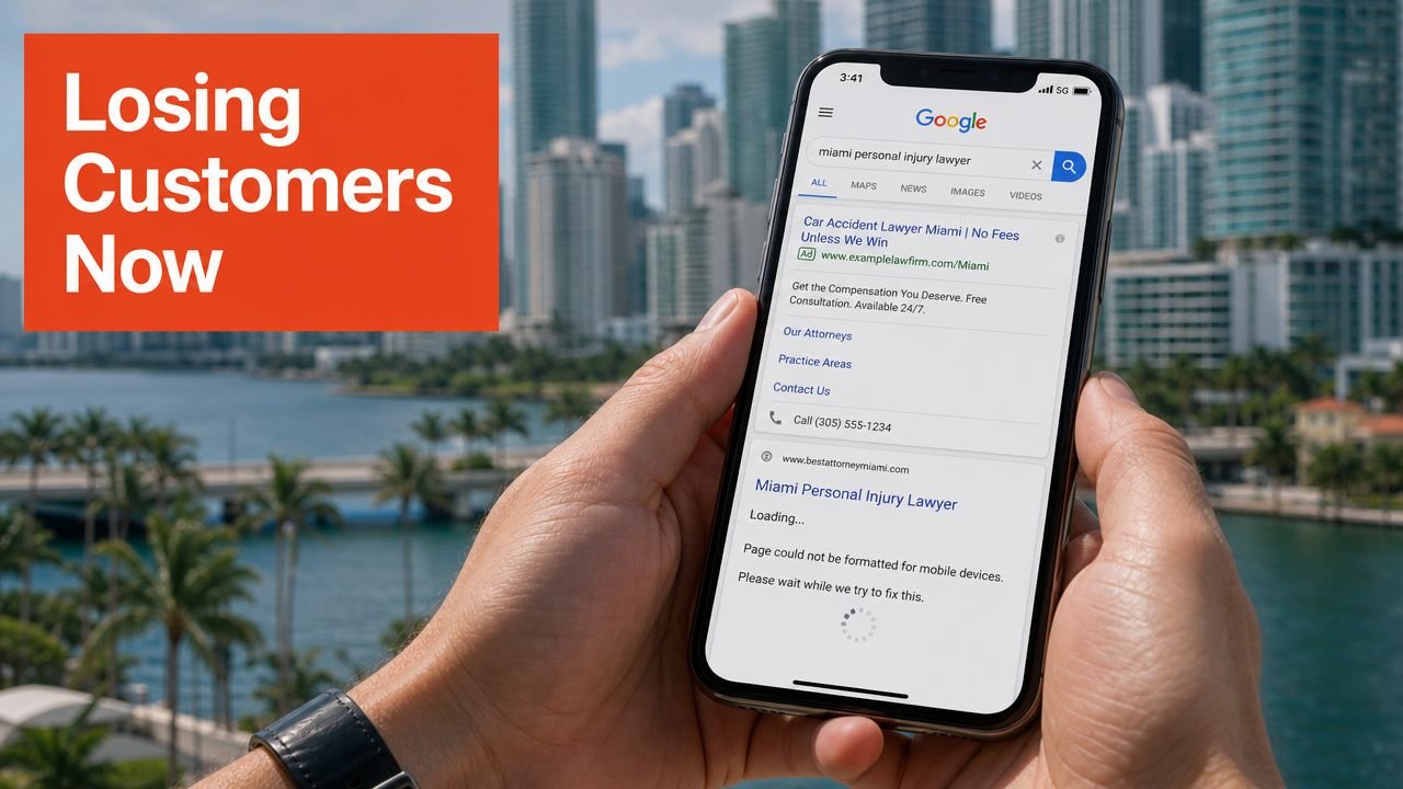
What this looks like in the real world
Someone searches for a service in Miami on their phone. They open two businesses.
Your competitor’s site gives them what they need fast. Clear headline. Tap-to-call button. Trust signals. Service area. Short path to action.
Your site makes them work. The hero image pushes the message down. The text feels cramped. The page hesitates before it becomes usable. The form is annoying on mobile.
That visitor doesn’t file a complaint. They leave.
Practical rule: If a prospect can’t understand what you do and how to contact you within a few seconds on mobile, your website is filtering out qualified leads for your competitors.
Why this is an SEO problem, not just a UX problem
This isn’t only about convenience. It affects visibility. One industry source reports that 92.1% of internet users access the web via mobile devices, and mobile accounts for nearly 60% of global web traffic. The same source explains that Google uses the mobile version of a website as the primary basis for ranking and indexing through mobile-first indexing.
That means a weak mobile experience can hurt two things at once:
- Your ability to rank for local and high-intent searches
- Your ability to convert the traffic you do get
If you’re investing in SEO, Google Ads, or local service visibility, mobile performance isn’t a side issue. It’s the front door.
A simple starting point is reviewing your current speed and usability bottlenecks. This guide on how to improve website loading speed is a useful benchmark if you want to see where your site is likely losing people.
If your mobile site feels even slightly frustrating, don’t assume prospects will tolerate it. They won’t. And they don’t need to. They have other options one tap away.
Why Mobile-Friendly Is a Low Bar That Costs You Leads
A lot of websites pass the casual test. They open on a phone. The layout stacks. The text technically fits the screen. The owner assumes that means the site is doing its job.
It usually isn’t.
A resized website is not a conversion system
“Mobile-friendly” often means the desktop site was squeezed into a smaller frame. That’s not the same as building around mobile intent.
A mobile visitor is usually trying to do one of a few things quickly:
- Call your business
- Check services and pricing context
- Confirm location or service area
- Read enough proof to trust you
- Submit a short form without friction
A weak mobile layout gets in the way of all five. Menus become crowded. Buttons sit too close together. Important copy drops too far down the page. Forms ask for too much. Tracking scripts and bloated design elements slow down the moment when the visitor is ready to act.
That hurts more than your website. It drags down every acquisition channel tied to it.
A mobile-friendly template can look acceptable in a preview and still perform badly where it counts: search visibility, ad efficiency, and lead volume.
For businesses running paid traffic, that pain shows up fast. You pay for the click, then send the visitor to a page that leaks intent.
For businesses relying on local SEO, the issue is just as serious. If your mobile setup is weak, you’re making it harder to compete for the searches that produce calls.
A helpful reference point is understanding mobile-first indexing and what it means for rankings. If Google evaluates your mobile version first, then “good enough on desktop” stops mattering.
Cheap templates miss the part that matters
The bigger problem with bargain websites isn’t that they’re ugly. It’s that they ignore decision-making behavior.
An industry analysis discussed by Nielsen Norman Group found that mobile-first designs can create long, sparse pages on desktop with fragmented content, which hurts scannability when teams don’t adapt layouts correctly for larger screens. That’s a major issue for high-consideration services, where people need to compare, evaluate, and build trust before contacting you. The nuance is explained in Nielsen Norman Group’s piece on content dispersion in mobile-first designs.
Cheap templates usually fail in one of two ways:
- They’re desktop-heavy, then awkwardly compressed for phones
- They go too minimal everywhere, leaving serious buyers without enough context to decide
Both mistakes cost leads.
If your site only checks the “mobile-friendly” box, you’re still vulnerable. High-intent visitors don’t reward effort. They reward clarity, speed, and ease.
Mobile-First Design The Strategy for Dominating Local Search
The term sounds technical, but the business idea is simple. Build the website around the device your prospects use first. Then expand the experience for larger screens without losing speed, clarity, or conversion focus.
That’s what proper mobile first website design does.
What mobile-first actually means for a business owner
It means the first questions are not about animations, sliders, or desktop flourishes.
They’re about business outcomes:
- What does a phone user need to know first?
- What action should happen first?
- What trust element removes hesitation fastest?
- What can be removed because it adds weight, not value?
This approach forces discipline. It prioritizes the headline, the offer, the call button, the form, the map context, the service proof, and the next step.
Older responsive workflows often start from a full desktop layout and then adapt downward. That can work visually, but it often leaves mobile with leftovers. Mobile-first starts with the critical path to conversion.
Mobile-First vs. Responsive Design What It Means for Your Business
| Factor | Mobile-First Design (Strategic) | Responsive Design (Adaptive) |
|---|---|---|
| Starting point | Built around phone users first | Often starts with desktop, then scales down |
| Content priority | Forces the essentials to appear early | Important content can get buried on smaller screens |
| Speed mindset | Encourages leaner pages from the start | Bloated desktop elements often remain |
| Local SEO impact | Better aligned with how search visitors actually arrive | Can underperform if mobile is treated as secondary |
| Conversion path | Designed for taps, calls, forms, and fast decisions | Often rearranges layout without improving decision flow |
| Business outcome | Supports lead generation and local search performance | Delivers basic adaptability, not necessarily better results |
A business that wants stronger local visibility should treat mobile-first as strategy, not styling. It aligns your site with how people search, compare, and contact businesses now.
If you serve a competitive market, design choices should also reflect local behavior and intent. These web design tips for Miami businesses show why a local market needs more than a generic responsive template.
The winning question isn’t “Does my site work on a phone?” It’s “Does my phone experience make contacting us easier than contacting the competitor?”
That’s the standard.
The Tangible ROI of a Mobile-First Approach
Business owners don’t need mobile-first because it sounds modern. They need it because weak mobile performance creates friction at the exact moment a prospect is ready to take action.
Here’s what that return looks like when the website is built to support search, ads, and conversion together.
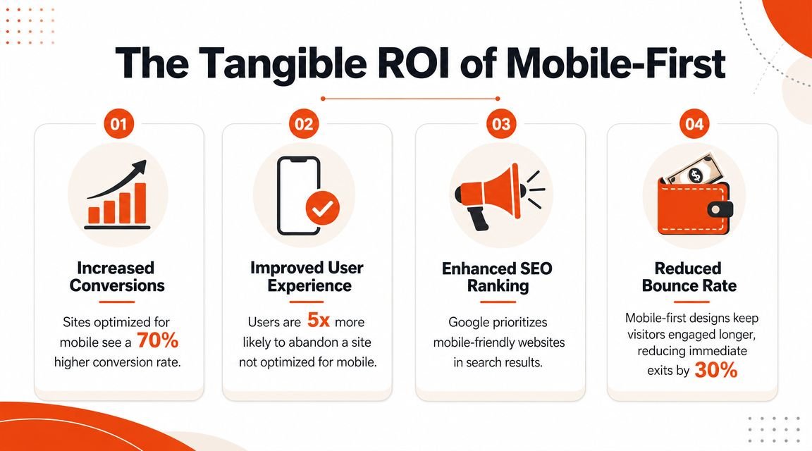
Where the return actually shows up
Research cited in industry reporting says websites optimized for mobile can achieve 23% higher conversion rates and 67% lower bounce rates, while some sources report up to 40% higher conversion rates for mobile-friendly websites. The same reporting also notes 35% more organic traffic on average for websites fully optimized for mobile-first indexing. The business case is outlined in this review of why mobile-first design is essential for growth.
That ROI shows up in a few places fast:
- Local SEO performance. Faster, clearer mobile pages support the experience Google wants to rank, especially for searches with immediate intent.
- Google Ads efficiency. Better landing page experience helps traffic behave better after the click, which protects budget and improves lead quality.
- Conversion rate. Strong mobile layouts reduce hesitation. Fewer distractions. Better forms. Easier calls. Cleaner paths to booking.
If you want to improve the second half of the funnel, this guide on effective strategies for increasing conversions is worth reading because it focuses on the practical barriers that stop users from finishing the action.
Why better mobile pages make every channel work harder
A strong mobile page does something most businesses overlook. It makes your marketing channels support each other instead of working against each other.
SEO brings the visitor in. Ads accelerate visibility. The website closes the gap between interest and inquiry.
When mobile is weak, that chain breaks.
A law firm can rank locally and still lose consultations because the contact path is clumsy on a phone. A restaurant can pay for clicks and still lose orders because the mobile menu or checkout experience feels annoying. A home service company can get map visibility and still lose leads because the service area and phone number aren’t obvious enough.
This is also why measurement matters. If you’re serious about lead generation, you need to see where mobile users drop off, where calls start, and which landing pages produce inquiries. A clean setup for Google Analytics 4 tracking and conversions helps expose whether your mobile experience is helping or hurting revenue.
For added context on how mobile UX affects business outcomes, watch this short overview before you audit your own pages:
The bottom line is simple. Better mobile design doesn’t just make the site look cleaner. It makes your SEO more productive, your ads less wasteful, and your traffic more likely to become customers.
Our Process What a High-Converting Mobile-First Build Includes
A proper mobile-first build is not a theme install with a few spacing tweaks. It’s a structured process that decides what matters most, removes friction, and protects performance from the start.
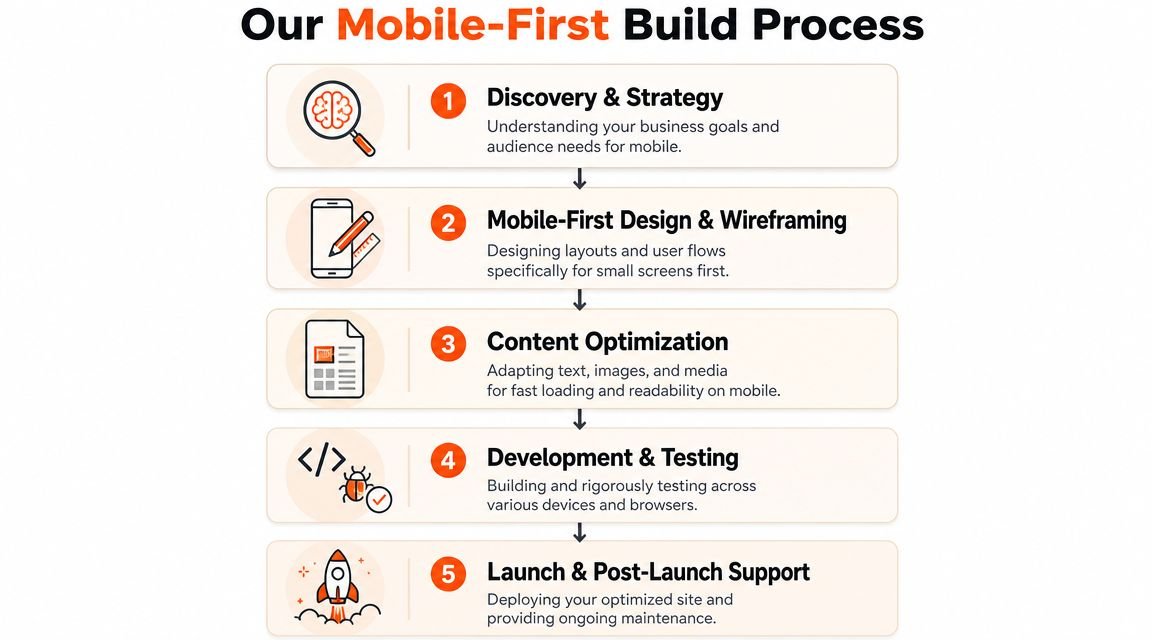
Content comes first
On mobile, every block has to earn its place. That means prioritizing the content most likely to drive action.
A high-converting build typically includes:
- A clear first-screen message that tells visitors exactly what the business does
- Primary calls to action such as call, quote, book, or order placed early
- Short trust builders like reviews, service areas, certifications, or proof of work
- Lean forms that ask only what’s necessary to start the conversation
This matters across industries. Restaurants need fast access to menus, reservations, and ordering. Service businesses need quick paths to calls and quote requests. If you want a simple example of how mobile decisions affect usability, TopFoodApp’s write-up on responsive menu design for mobile ordering shows why navigation and content order can directly affect action.
Performance is built in, not bolted on
A serious mobile-first build also targets the technical thresholds Google associates with a strong user experience: Largest Contentful Paint under 2.5 seconds, Interaction to Next Paint under 200 ms, and Cumulative Layout Shift under 0.1, based on guidance summarized in best practices for mobile-first websites.
Getting there usually requires real work:
- Images are compressed and resized so they don’t choke the first load
- Non-critical scripts are deferred so the page becomes usable faster
- CSS and JavaScript payloads are minimized to reduce unnecessary weight
- CDN delivery is used so core content reaches mobile users quickly
Good mobile performance rarely happens by accident. Teams have to design for it, develop for it, and test for it.
That level of build quality is one reason generic themes disappoint once traffic starts hitting them.
Desktop still matters
The smartest mobile-first work doesn’t ignore desktop. It adapts intelligently.
That means reviewing whether desktop users still see grouped information, whether pages become too stretched, and whether the layout supports scanning for buyers doing deeper research. In this scenario, strategy matters more than templates.
A business owner comparing vendors should also understand what goes into a site built to produce leads, not just pageviews. This breakdown of how to build a lead generation website is a practical reference because it ties structure and messaging directly to inquiry generation.
The difference is simple. Amateur builds chase appearance. Professional builds control intent, speed, and action.
Your Mobile-First Website Checklist
A lot of owners ask the same question. Can’t I just use a Shopify theme, a WordPress template, or a page builder and call it done?
You can. You just shouldn’t expect it to dominate local search or consistently turn mobile traffic into leads.
The DIY question deserves a direct answer
Templates are fine for getting online. They’re not enough for competitive markets where multiple businesses are fighting for the same local clicks, calls, and map visibility.
The issue isn’t that templates never work. The issue is that they rarely solve the full chain:
- Search intent
- Mobile usability
- Speed under real conditions
- Conversion flow
- Tracking
- Desktop adaptation
- Ongoing optimization
That matters even more as search changes. Google reported that AI Overviews reached more than 1.5 billion users monthly by May 2024, and current guidance around mobile-first design increasingly points toward concise, answer-ready content and fast performance that both AI systems and mobile users can process easily. Figma’s overview of mobile-first design and AI-era search behavior captures that shift well.
If your site is slow, vague, or cluttered, it doesn’t just frustrate users. It becomes harder to surface, easier to ignore, and less likely to convert.
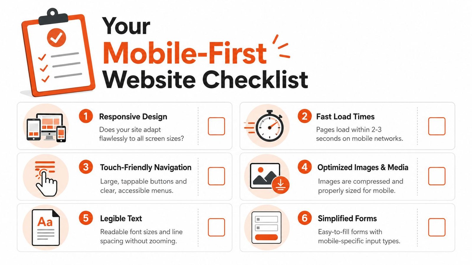
Use this checklist before you hire anyone
Use this as a real decision tool. If you can’t confidently check these boxes, your mobile setup probably needs work.
- The site loads fast on mobile. Not “eventually.” Fast enough that users can interact without frustration.
- The primary call to action appears early. Call, quote, book, reserve, or order should not be hidden below oversized visuals.
- The text is easy to read without zooming. If visitors have to work to read, they’ll leave.
- Buttons are easy to tap. Phone users shouldn’t have to aim carefully to contact you.
- Navigation is simple. The menu should help users move forward, not make them think.
- Forms are short and practical. Every extra field lowers the chance of completion.
- Key trust signals appear before doubt sets in. Reviews, service area, credentials, and proof should support the decision quickly.
- Desktop layouts are adapted, not stretched. Mobile-first should still support scanning and comparison on larger screens.
- Core Web Vitals are being monitored. If nobody is checking performance thresholds, problems will pile up.
- Analytics and lead tracking are configured. If you don’t know where mobile leads come from, you can’t improve them.
If your website fails this checklist, it’s not a branding issue. It’s a revenue issue.
Many owners often lose time. They keep adjusting surface-level design choices while actual problems stay in place. The smarter move is to evaluate the site like a sales asset, because that’s what it is.
If your business depends on local visibility, inbound calls, quote requests, or online sales, this is not the place to cut corners. VIP TECH CONSULTING helps Miami businesses build faster, conversion-focused websites that support SEO, Google Ads, and real lead generation. If you want a clear assessment of where your current mobile experience is costing you business, book a strategy call and get direct recommendations before another month of traffic slips away.